
Project Overview
Mayhem Racing Charities’ School of Speed needed a bold, high-impact brand identity that reflected the intensity and precision of motorsports. The objective was to create a visual system that captured speed, competition, and motion while remaining flexible enough to scale across digital platforms, print materials, and event environments.
The focus of this project was the brand itself, not a specific product or user flow. Every element needed to communicate energy, performance, and purpose at a glance.
Project Scope
- Deliverables: Primary and secondary logo variations, standalone logomark, custom brand pattern, defined color palette and typography, production-ready logo files in vector and raster formats, and a comprehensive brand guidelines PDF supporting digital, print, signage, and merchandise applications.
- Tools: Adobe Illustrator, Adobe Photoshop
- Role: Creative Director, Brand Strategist, Visual Identity Designer
Brand Challenge
Motorsports branding demands immediacy. It must feel fast, aggressive, and competitive, while still maintaining clarity and professionalism. The challenge was translating the physical sensation of speed into a static visual identity that could remain impactful across a wide range of touchpoints.
The brand needed to feel active even when not in motion.
Concept and Design Approach
The identity was built around the idea of perpetual movement. Typography, geometry, and color were all selected to visually reinforce acceleration, momentum, and precision. Sharp angles and forward-leaning forms were used throughout the system to ensure the brand felt dynamic, not decorative.
Every design decision was intentional and performance-driven.


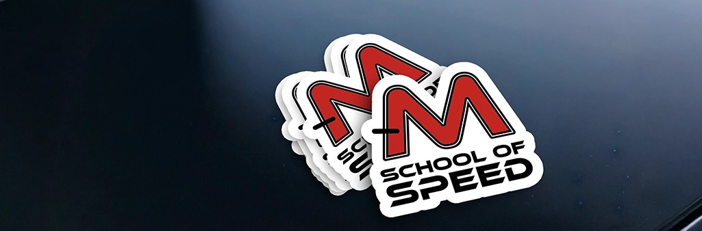
The ‘M’ Logomark
At the core of the identity is the custom ‘M’ logomark. Designed to resemble an overhead view of a race track, it creates an immediate and intuitive connection to motorsports culture. A bold black line represents the start and finish line, reinforcing competition, progression, and achievement.
The slanted geometry of the mark suggests acceleration and forward motion, ensuring the logo conveys speed even when static.

Logo System and Variations
To support real-world usage, a flexible logo system was developed:
- Primary horizontal logo for standard branding applications
- Vertical logo for compact and stacked layouts
- Standalone logomark for instant recognition and high-impact use
- Custom pattern system derived from the logo to extend the brand across apparel, banners, and marketing materials
This modular system allows the brand to remain consistent while adapting seamlessly across formats and environments.
Visual Language
The color palette centers on deep reds and blacks, chosen to evoke adrenaline, power, and the intensity of race day. Typography is sharp, angular, and performance-oriented, reinforcing the speed-focused personality of the School of Speed.
Together, these elements create a visual language that feels bold, confident, and unmistakably rooted in motorsports.


Brand Consistency Across Touchpoints
Consistency was a core requirement of the project. The identity was designed to scale across signage, event materials, merchandise, and digital platforms without losing impact or clarity.
A comprehensive brand guidelines PDF was delivered to ensure the system could be applied consistently by future teams, partners, and vendors.


Outcome
The final brand identity delivers a strong, recognizable presence that captures the excitement and competitiveness of racing while supporting the organization’s charitable mission. The system is bold, flexible, and built to perform wherever speed and impact matter most.


