
Project Overview
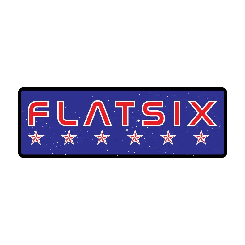
Flat Six was a primary logo design created for a contract under that name. The logo draws inspiration from the flat-six engine lineage, a configuration closely associated with precision engineering, balance, and performance.
The objective was to create a technically grounded mark that referenced this engineering heritage in a refined and original way, without relying on literal automotive branding or extended brand systems.
Project Scope
- Deliverables: Primary logo design, standalone logomark, defined color palette, and production-ready logo files in vector and raster formats.
- Tools: Adobe Illustrator, Adobe Photoshop
- Role: Creative Director, Brand Designer

Brand Challenge
The flat-six engine lineage carries strong associations with mechanical balance, smooth operation, and performance credibility. The challenge was to distill these qualities into a single, minimal mark that could communicate technical intent without becoming illustrative or overly complex.
With only a primary logo in scope, clarity and restraint were essential.

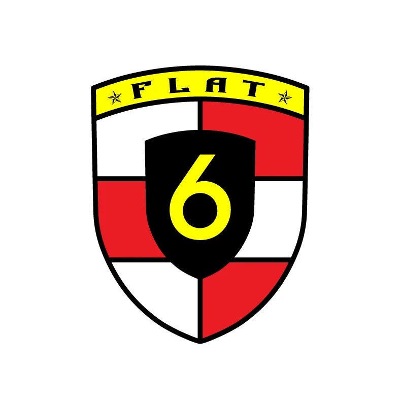
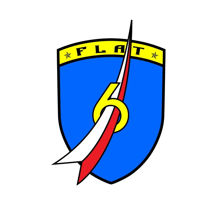

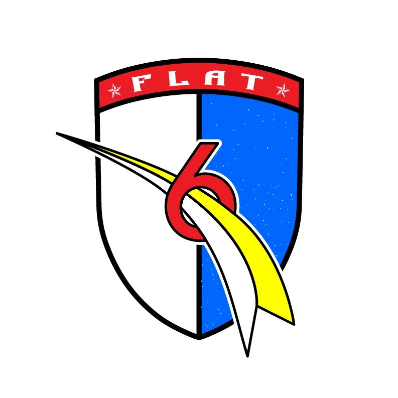
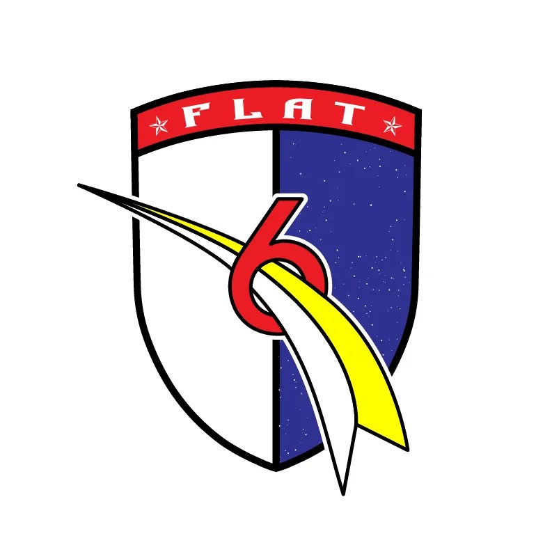
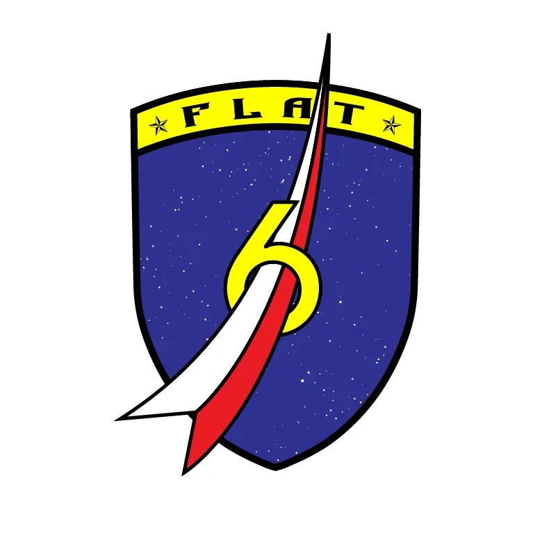
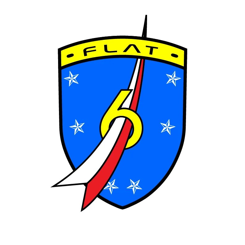

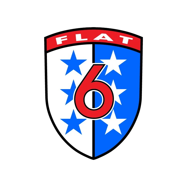
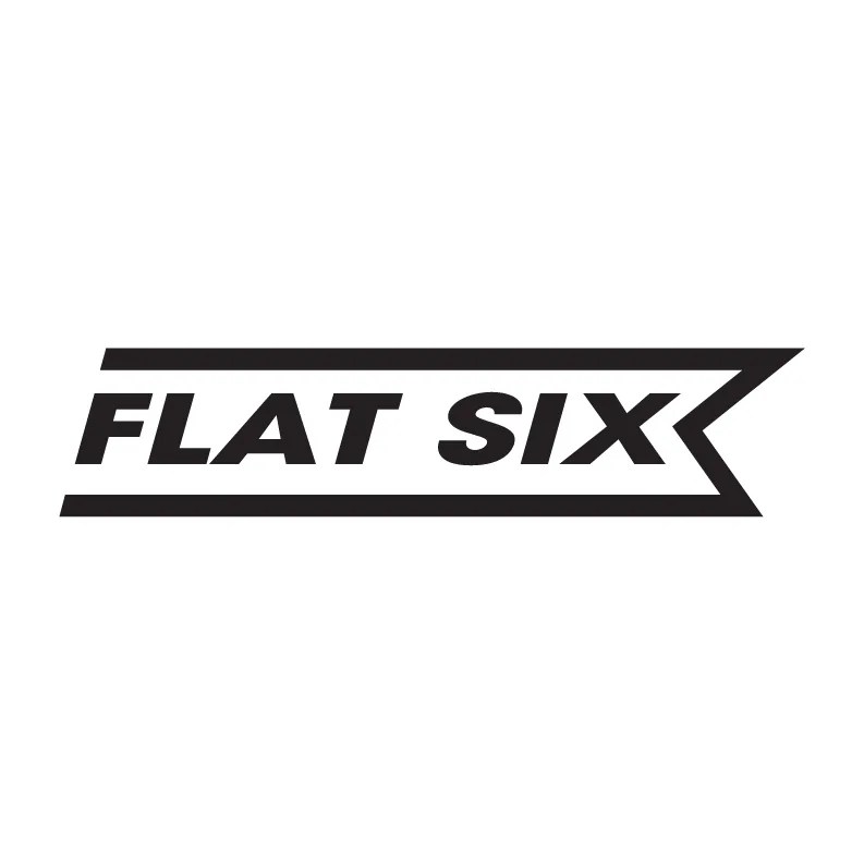
Early concepts
Concept and Design Approach
The logo was designed as an abstraction rather than a literal depiction. Initial concepts leaned heavily on an automotive badge style mark, which never seemed appropriate . The secondary approach focused on structure, proportion, and symmetry, drawing from the underlying engineering principles of the flat-six layout rather than its external appearance.
This allowed the mark to feel engineered and intentional, aligning with the lineage it references.
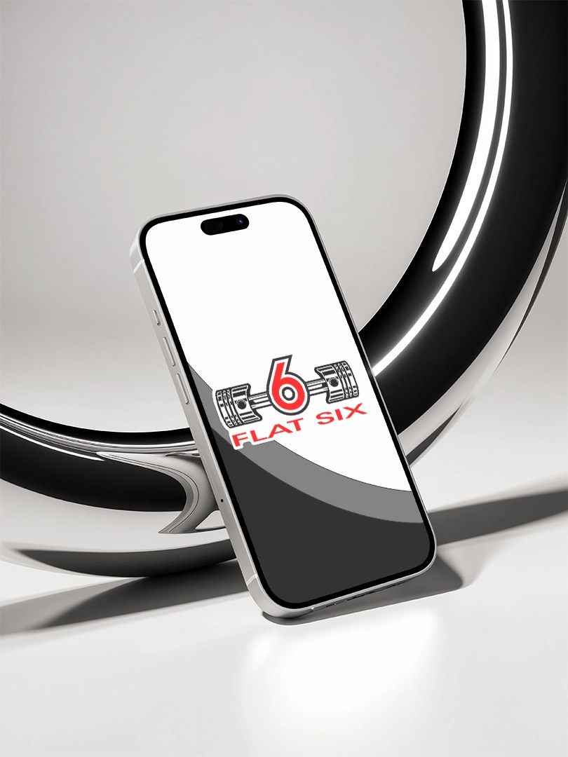
The Pistons Mark

The logo features stylized pistons arranged to reflect the horizontally opposed nature of the flat-six configuration, with three cylinders on each side of a central axis. This layout references the engine’s inherent balance and low center of gravity, qualities that have defined the flat-six lineage over decades.
The simplified silhouette communicates the idea of the engine as the core of the project while remaining visually restrained.
Symmetry and Precision
Symmetry is central to the mark’s construction. Mirrored forms and consistent spacing reflect the balance and harmony found in flat-six engine design. Every element was refined to reinforce precision, control, and mechanical discipline.
The result is a logo that feels deliberate, stable, and performance-driven.

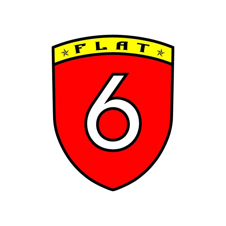
Color Palette
The color palette draws inspiration from Porsche’s heritage, most notably Guards Red and Carrara White. These colors reference speed, legacy, and motorsports culture without directly imitating existing branding.
Used together, the palette conveys energy and confidence while maintaining a clean, modern aesthetic.


Engineering Reference
A flat-six engine, also known as a horizontally opposed six-cylinder engine, features three cylinders on each side of a central crankshaft. In the boxer configuration, opposing pistons move inward and outward simultaneously, creating exceptional balance and smooth operation. This mechanical layout has become synonymous with Porsche performance and remains a defining element of the brand’s identity.
This engineering principle informed both the structure and symbolism of the logo.

Outcome
The final logo delivers a clean, technically informed identity that references the flat-six lineage through form and structure rather than literal representation. It stands as a focused, production-ready mark designed to communicate precision and performance with restraint.