Project Overview
Quantum Quest was a conceptual brand and UI project completed as part of an online Figma course. To simulate real world constraints, the project brief was generated using a random UX and UI project generator. The goal was to treat the assignment as a realistic client engagement rather than a purely academic exercise, emphasizing strategy, brand thinking, and visual decision making.
This project ultimately evolved beyond interface design into a foundational brand exploration for a fictional mobile phone service.
Project Scope
- Project: Quantum Quest
- Role: Brand Design, Logo Design, UI Exploration
- Tools: Figma, AI Logo Exploration Tools, Adobe Illustrator
- Timeline: Self directed course project
- Context: Online UI and UX coursework using a randomized project brief

The Brand Challenge
The central challenge was to design a modern, credible brand in a highly saturated category without relying on clichés or visual noise.
Many contemporary tech brands lean heavily on excessive gradients, abstract chaos, or aggressive futurism. For Quantum Quest, the objective was different. The brand needed to communicate intelligence, continuity, and trust through restraint and structure rather than spectacle.
This required a strong core mark that could scale, adapt, and remain recognizable without constant embellishment.restrained, intelligent approach that respected the user’s experience level and schedule.
Logo Exploration and Concept Development
The logo development process began with broad exploration using AI based logo tools to rapidly generate a wide range of conceptual directions. This phase was intentionally loose, serving as a way to surface interesting forms and metaphors rather than finished solutions.
One early concept, shown in the initial exploration image, stood out due to its use of continuous circular forms and directional elements. That concept became the foundation for refinement rather than a final answer.
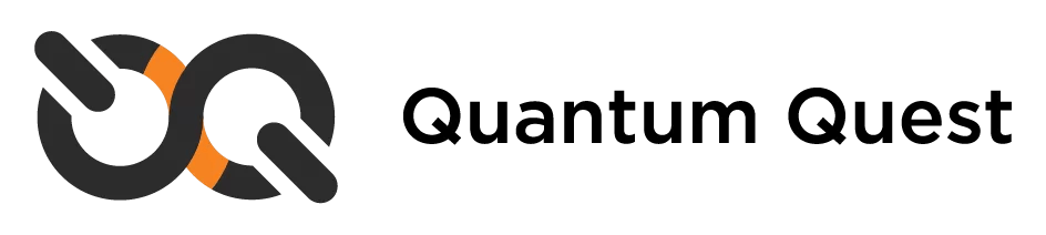
Through iterative sketching and vector refinement, the mark evolved into a symbol built from two interlocking circular paths. These forms suggest continuity, connection, and ongoing motion. The angled bars introduce direction and progress while maintaining balance within the overall structure.
The result is a mark that feels technical and modern without becoming cold or mechanical.


Visual Language and Color System
The color palette was intentionally restrained. A dark neutral base establishes stability and professionalism, while a single high energy accent introduces contrast and focus.
This approach reinforces the brand’s clarity and avoids visual fatigue. The accent color is used sparingly, allowing it to guide attention rather than dominate the composition.
The visual language favors strong geometry, consistent stroke weights, and clear negative space. These choices support legibility and scalability across contexts, from app icons to large format applications.

Logo System and Applications
Once the primary mark was established, a flexible logo system was developed to support multiple orientations and use cases.
This included:
- A primary stacked mark
- A horizontal variation
- A standalone symbol suitable for small scale usage
Each variation preserves the core geometry and proportions of the mark, ensuring consistency and recognition regardless of placement. The system was designed to feel intentional and complete rather than improvised.


Digital First Considerations
Although the project is brand focused, the identity was designed with digital environments in mind. The forms, spacing, and contrast all translate cleanly to screens, ensuring the brand feels native within modern interfaces.
This digital first mindset reinforces the brand’s relevance while keeping it flexible enough for future expansion into other mediums.

Outcomes and Learnings
This project reinforced the value of treating brand identity as a system rather than a single logo.
Key learnings include:
- Strong brands rely on structure as much as aesthetics
- Restraint often communicates confidence more effectively than complexity
- AI tools are most valuable as exploration aids, not solution generators
By reframing a course assignment as a branding challenge, the project resulted in a more mature and portfolio worthy outcome.
