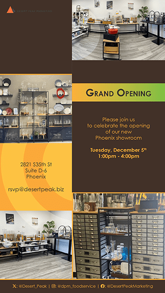
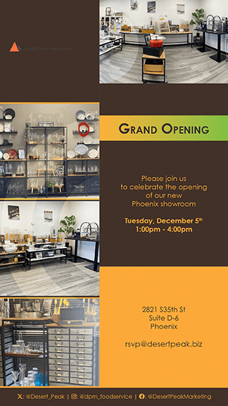
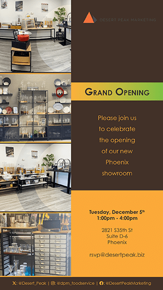
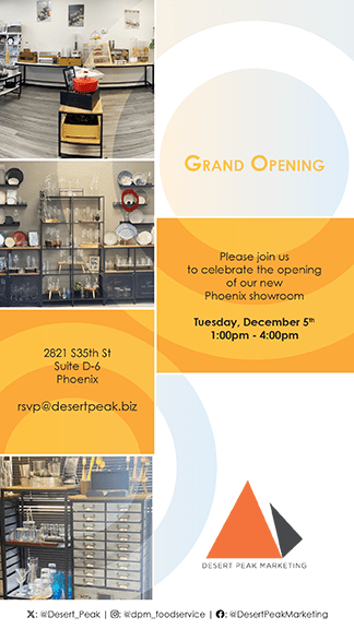
As I look back on the design of the flyers for the grand opening of the Phoenix showroom, I can’t help but feel a sense of pride in how everything came together. The process of creating these promotional materials was both challenging and rewarding.
Embracing Minimalism for Maximum Impact
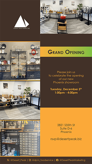
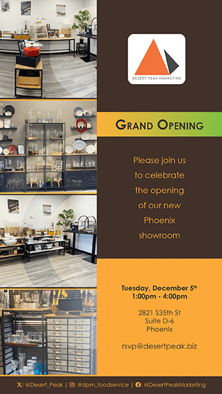
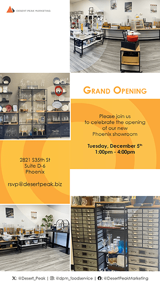
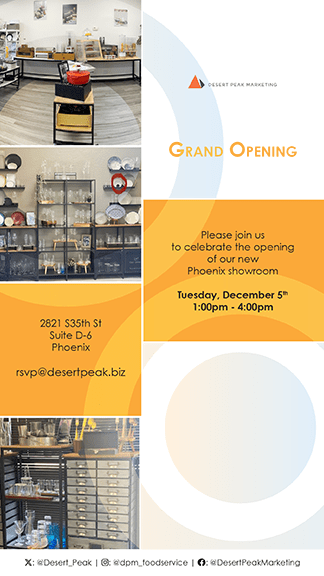
One of the key decisions I made early on was to adopt a minimalist approach for the flyers. I wanted to ensure that the essential information—like the event date, time, and location—was immediately clear to anyone who saw the flyer. By stripping away unnecessary details, I aimed to create a design that was both clean and effective.
Why Minimalism?
- Clarity: I knew that people often skim through content quickly, so I wanted to make sure that the most important details were easy to find and understand at a glance.
- Professionalism: A minimalist design also conveys a sense of professionalism, which I felt was crucial for an event like this, where the first impression really matters.
Thoughtful Typography Choices
Typography was another area where I paid close attention. I chose a modern, sans-serif font that was both stylish and legible, ensuring that the flyer would be easy to read. The consistency in font choice across all the flyers helped create a cohesive and polished look.
Key Typographic Decisions:
- Font Weight Hierarchy: I used heavier fonts for the most important information, like the event date and time, and smaller fonts for the secondary details. This helped guide the viewer’s eye through the flyer in a logical way.
- Centered Alignment: By centering the text, I aimed to give the flyer a balanced, harmonious feel, which I felt was in keeping with the formal yet celebratory nature of the event.
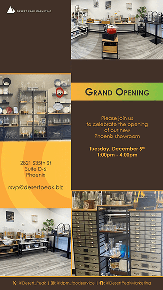
A Harmonious Color Palette
When it came to color, I opted for a subtle, sophisticated palette. I used neutral tones to keep the design clean and modern, with just a hint of warmth to make the flyer inviting.
Color Choices:
- Neutrals: Neutral colors like brown and grey helped keep the design uncluttered and allowed the text to stand out without overwhelming the viewer.
- Accent Colors: I used warm accent colors sparingly, to highlight the grand opening announcement. This choice helped draw attention to the key messages without overpowering the overall design.
Maintaining Consistency Across Formats
One of the challenges I faced was ensuring that the design would work consistently across different formats, both digital and print. I worked hard to create a layout that would look great whether the flyer was seen on a screen or in someone’s hand.
Consistency Elements:
- Uniform Layout: By keeping the layout consistent across all versions of the flyer, I was able to reinforce brand recognition. I wanted people to immediately identify the flyer as part of the Phoenix showroom promotion, no matter where they saw it.
- Brand Integration: Including the social media handles and contact information prominently in each flyer was a deliberate choice. It tied the physical event to the online presence, making it easy for people to connect with the brand before the event even happened.
Inviting Engagement
Finally, I designed the flyers not just to inform, but also to engage. By including social media handles, I wanted to encourage people to connect online and share their excitement about the grand opening. It was a way to build a sense of community and anticipation leading up to the event.
Call to Action:
- Social Media Integration: By prominently displaying the social media handles, I hoped to encourage viewers to follow the event updates and engage with the content. It was a subtle way to build a connection with the audience before they even attended the event.
- Clear RSVP Information: I made sure to include clear instructions on how to RSVP. I knew that making the process easy would increase the chances of people attending the event.