
Project Overview
The 2023 Ponderosa High School Football season inspired a full set of weekly social media graphics designed for the Football Booster Club. The goal was to create visually engaging content that captured the excitement of each game while reinforcing the team’s identity through consistent branding.
The graphics balanced aesthetics and utility: providing fans with essential game information while reflecting the spirit and energy of the team.
Project Scope
- Deliverables: A full season of static social media graphics for weekly games, featuring consistent visual identity elements including team colors, textures, and typography.
- Tools: Adobe Photoshop
- Role: Designer, Visual Brand Strategist
Design Challenge
High school football campaigns rely on consistency and recognizability. The challenge was to create a weekly series that:
- Clearly communicates game details (date, time, opponent, venue)
- Builds team pride and anticipation among fans
- Remains visually engaging across the full season
- Stays on-brand while adding variety and excitement
The design needed to feel handcrafted, energetic, and aligned with the team’s cardinal and gold identity.

Concept and Design Approach
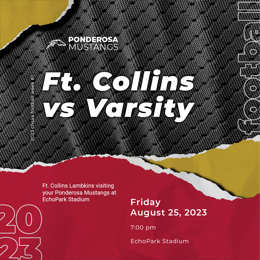
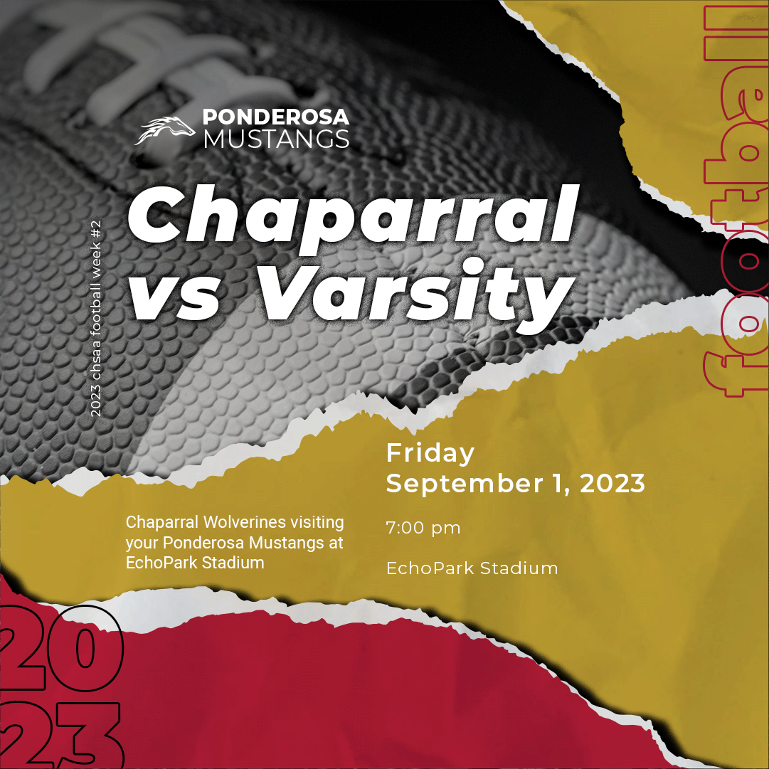
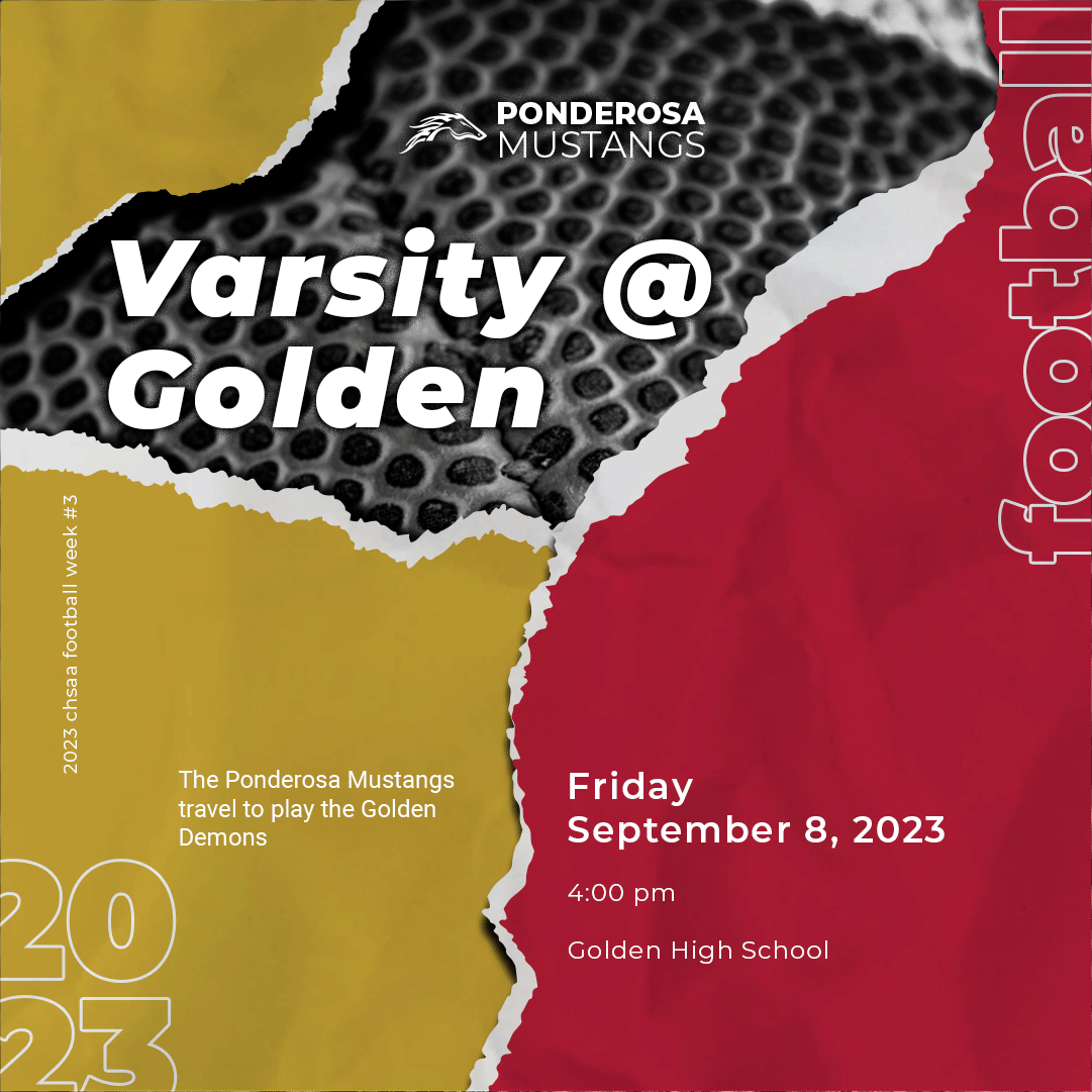
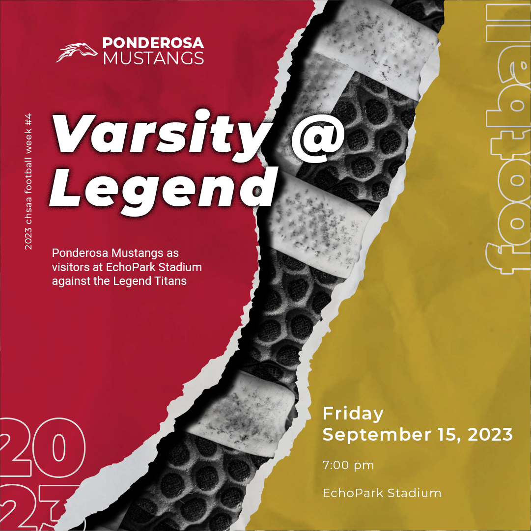
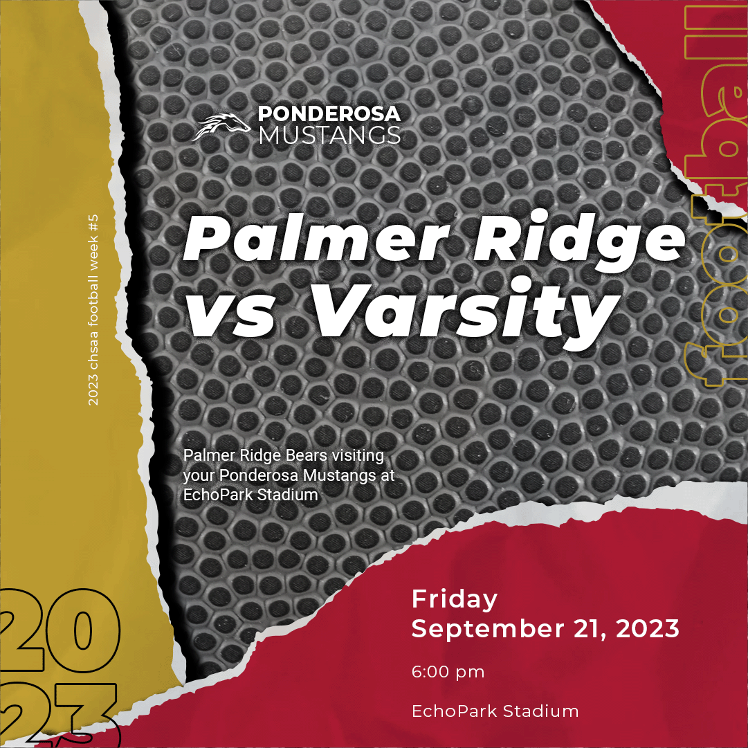
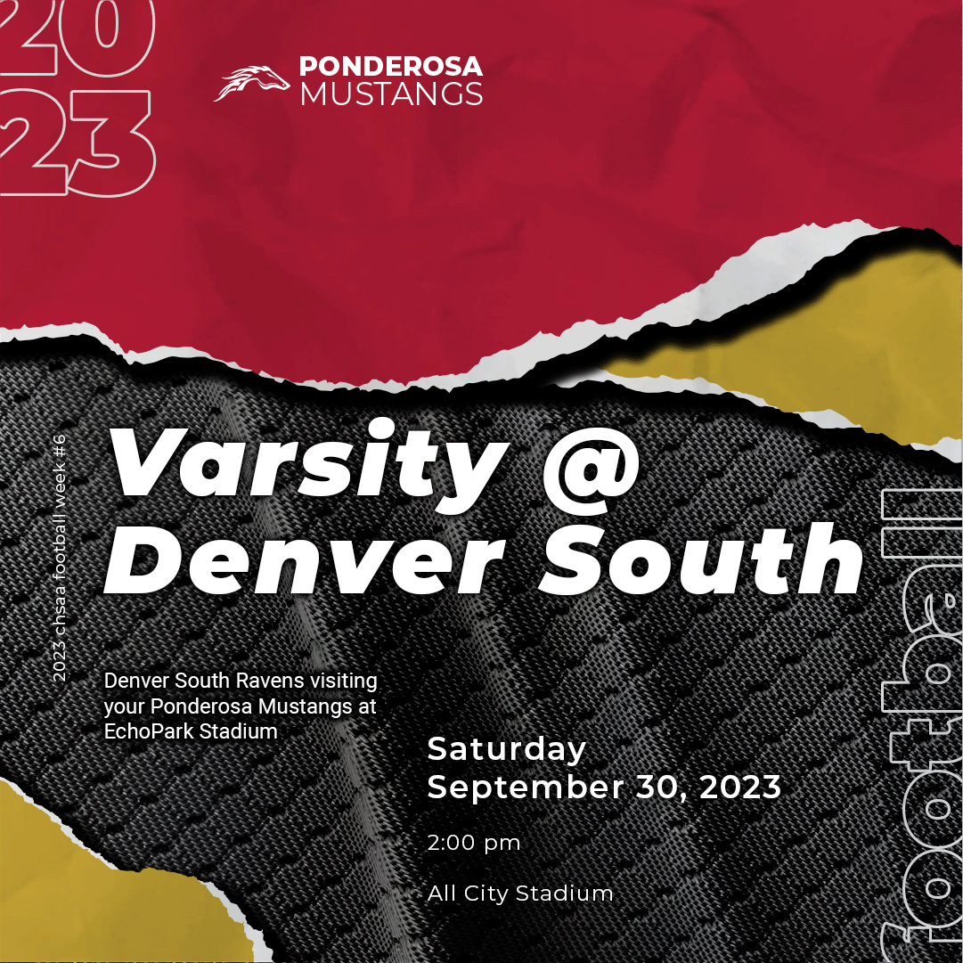
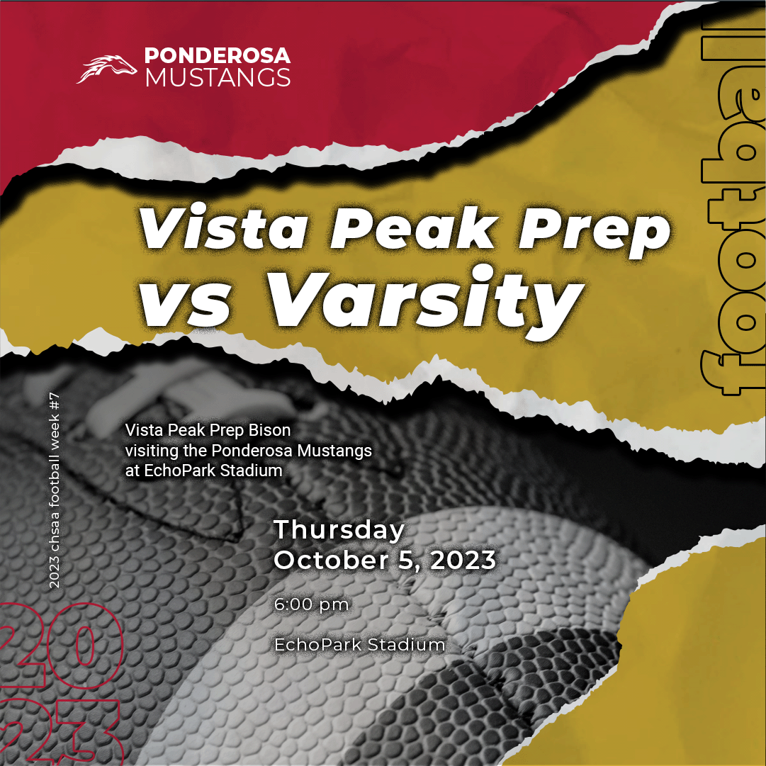
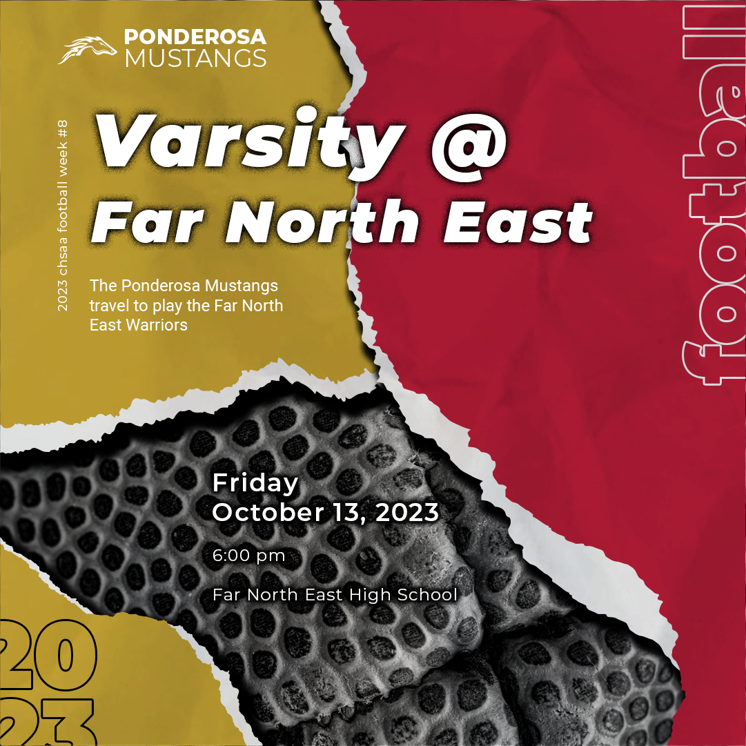
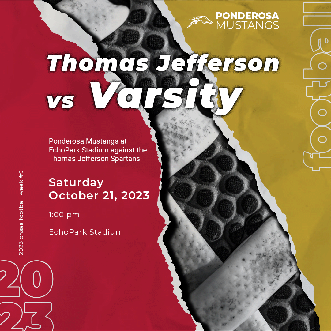
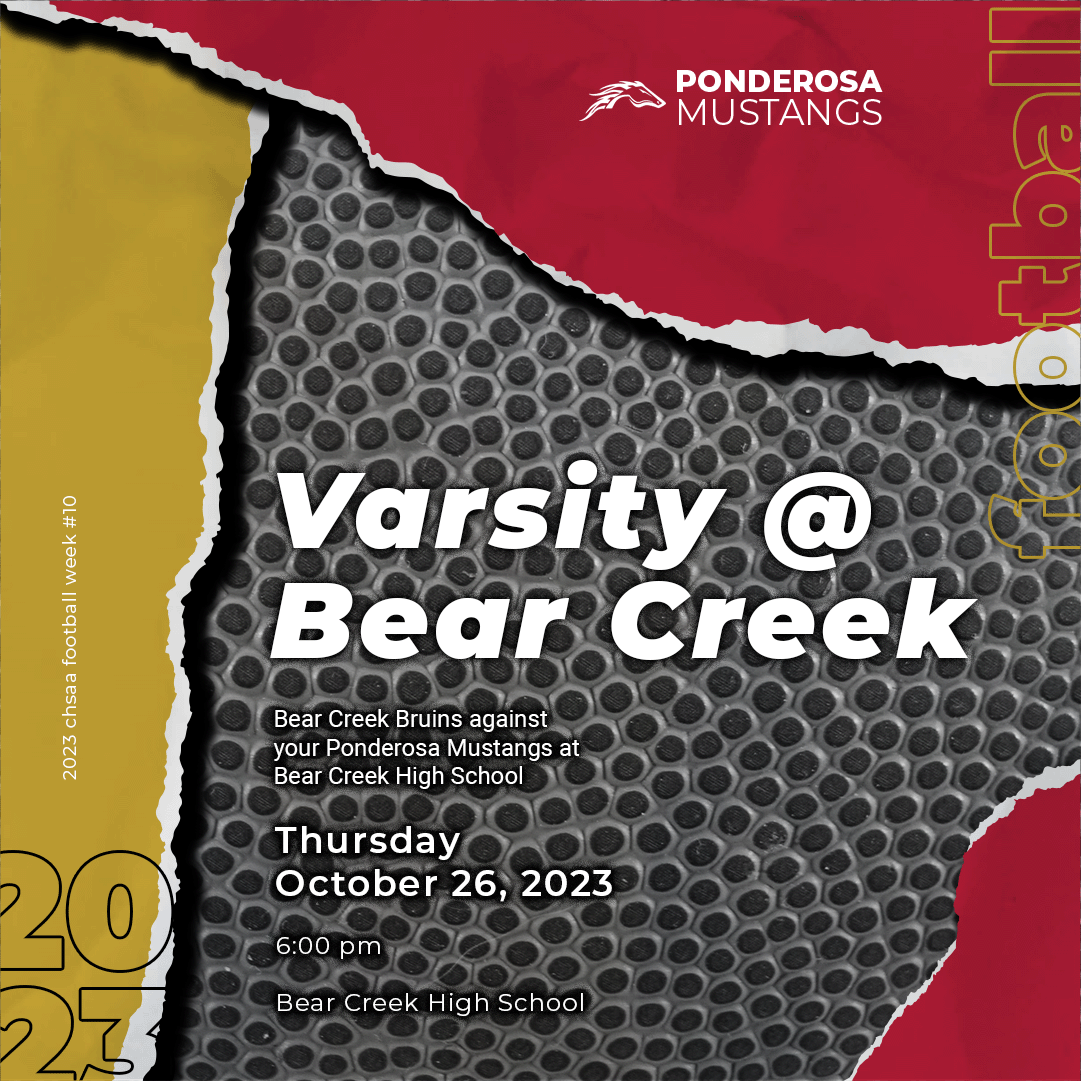
The design was built around a torn paper theme, giving each graphic an authentic, handcrafted feel, as if posters had been torn straight from the walls of the school. This approach created instant recognition and a touch of nostalgia.
Textures and Depth
To bring the games to life, textures were layered throughout the graphics:
- Football laces and patterns
- Jersey material textures
- Worn or distressed football surfaces
These textures added depth, movement, and realism while reinforcing the sport-centric focus.
Color Palette
Team colors, cardinal and gold, were consistently applied to create strong visual identity and school spirit. These colors were carefully balanced with texture overlays to maintain clarity and legibility.
Weekly Graphic Elements
Each graphic consistently included:
- Game Date and Time: Bold, easy-to-read typography for instant information
- Opponent: Name and logo to build competitive anticipation
- Team Logo: Prominent placement to reinforce unity and identity
- Venue: Ensuring fans had the necessary logistical details
Consistency across these elements allowed the full season’s graphics to feel cohesive while maintaining excitement for each individual game.
Outcome
The full-season graphics successfully combined visual design skill with strategic branding:
- Consistency: The torn paper theme, color palette, and textures provided instant recognition
- Utility: Each graphic conveyed key game information clearly
- Engagement: Fans were able to follow the season visually, strengthening team pride and identity
This project demonstrates how design thinking can be applied to recurring content for sports organizations, balancing aesthetics, information, and brand consistency.