Project Overview
This project marked the beginning of a personal redesign series focused on Estes Park Brewery, a long-standing Colorado brewery founded in 1994 in Estes Park. The existing logo follows a familiar craft beer convention, a circular crest paired with a ribbon banner carrying the brewery name. While recognizable, the mark reflects a traditional aesthetic that has become increasingly common within the craft beer landscape.
This exploration reimagines the brand with a more modern visual identity, one that better reflects its geographic setting, elevation, and connection to the Rocky Mountains.


Project Scope
- Deliverables: Vector logo files, Color and Black & White, mock-ups
- Tools: Adobe Illustrator
- Role: Designer
Design Challenge
Craft breweries often rely on heritage-inspired marks that emphasize tradition over place. In this case, the challenge was to move beyond established brewery tropes while still respecting the brand’s roots and sense of authenticity.
Key challenges included:
- Representing both product and place in a simple, memorable form
- Avoiding overused brewery iconography such as crests and ribbons
- Creating a mark that feels contemporary without losing character


Concept Development
Initial sketching began with traditional brewery-inspired layouts. These early directions quickly revealed the limitations of familiar forms and prompted a shift in approach. Rather than designing around convention, the focus moved toward distillation.
At its core, the brand can be defined by two elements:
- Beer
- Mountains
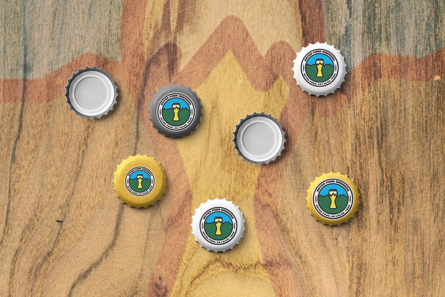
By reducing the concept to these fundamentals, the design became more focused and intentional. The resulting mark blends references to brewing with a simplified mountain form, emphasizing Estes Park’s high elevation and its relationship to the surrounding landscape.

Visual Direction
The logo favors clarity and restraint over ornamental detail. Clean geometry and simplified forms allow the mark to feel modern, versatile, and scalable across packaging, signage, and merchandise.
Design characteristics include:
- Minimalist construction for strong legibility
- Mountain imagery abstracted rather than literal
- A balanced composition that avoids traditional crest formats
- A visual identity that feels rooted in place rather than nostalgia


Outcome
This logo redesign reframes Estes Park Brewery through a contemporary lens while maintaining a clear connection to its environment. By stripping the concept down to its essentials, beer and mountains, the mark becomes more distinctive and less reliant on overused visual patterns within the craft beer category.
The project serves as an early foundation for a broader personal series exploring how established brands can evolve visually while staying true to their origins.